- News · Product
- Estimated reading time:1 min read
Give your storefront footer a point of view
- By Stoify
Stoify adds Editorial, Minimal Utility, and Split Showcase footer layouts while keeping the familiar Classic footer in place.
Share this page
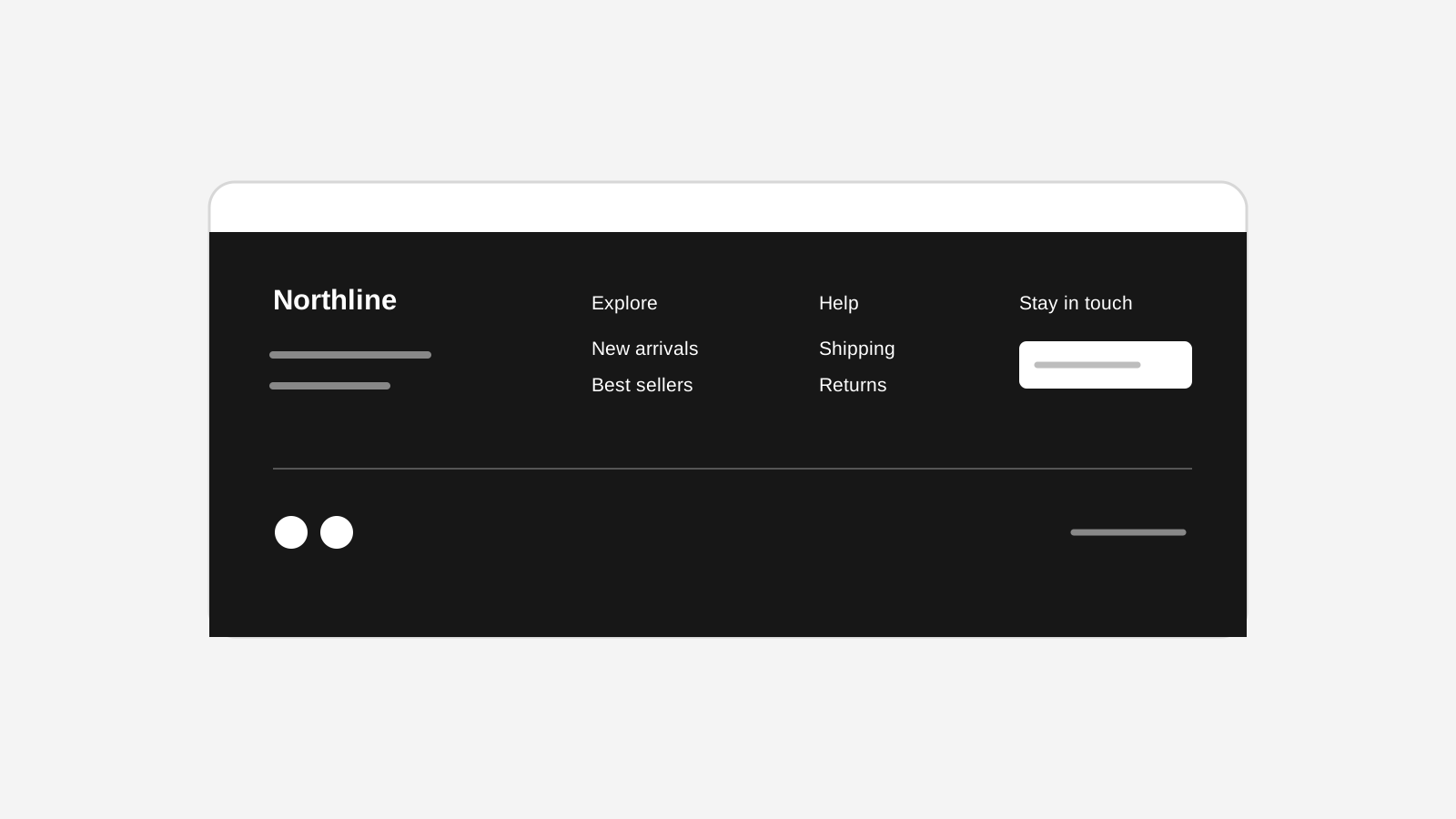
Today we’re adding more room for a storefront’s final impression. Stoify’s footer builder now keeps Classic as the safe default and adds three new directions: Editorial, Minimal Utility, and Split Showcase.
Editorial is designed for brands that want the footer to feel like part of the campaign rather than a utility shelf. Add a statement, choose a large text or image wordmark, and finish with grouped links and a legal rail. Minimal Utility is deliberately compact. Split Showcase gives the brand side and navigation side a more balanced, asymmetric composition.
The content model stays shared across all four layouts. Merchants can keep their existing brand, tagline, social links, payment marks, address, legal links, and footer columns while changing the structure around them. Supported copy can also be edited directly in the builder preview.
The dashboard preview and storefront use the same renderer, and uploaded wordmarks follow the existing site-scoped media cleanup rules. Explore the footer layouts for the full details.
Continue exploring
Related Stoify articles and feature pages connected to this topic.