
- Storefront experience
- Storefront builder
- Estimated reading time:1 min read
Extensible storefront footer layouts
Keep the classic footer or switch to Editorial, Minimal Utility, and Split Showcase layouts with configurable wordmarks, link groups, and legal rails.
Share this page
A footer that can match the storefront
The footer is often the last piece of a storefront to get serious design attention. Stoify now lets merchants keep the dependable Classic footer or choose a layout with a stronger editorial point of view.
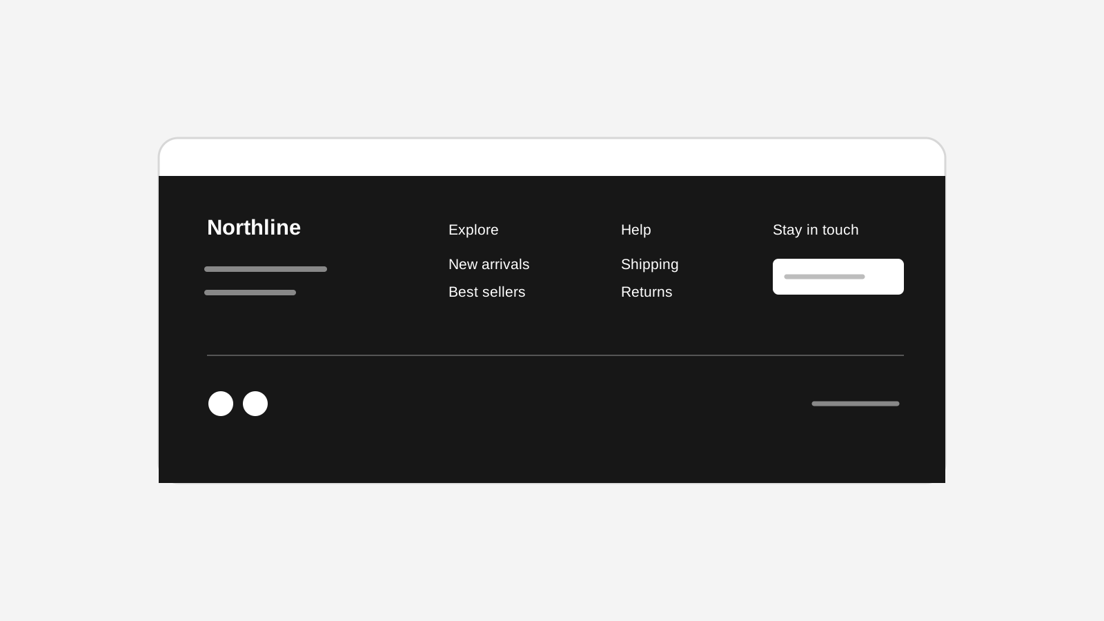
Editorial gives the footer room to breathe: a statement, grouped navigation, an optional legal rail, and an oversized wordmark that can be text or an uploaded image. Minimal Utility keeps the same information close to the edge of the page, while Split Showcase gives the brand statement and navigation equal visual weight.
Configurable, not locked to a template
Every layout uses the same editable footer content. Choose the store branding, tagline, social links, payment marks, legal links, address, and link groups from the builder inspector. Layout-specific controls cover wordmark source, size, alignment, visibility, and optional statement content.
Safe across preview and storefront
The dashboard preview and published storefront share the same footer layout renderer, so a layout change can be reviewed at desktop and mobile widths before publishing. Uploaded wordmarks use the existing site-scoped builder media lifecycle and are removed when they are no longer referenced.
Read the launch story in Give your storefront footer a point of view.
Related reading
Deeper Stoify writing connected to this workflow.
More features
Explore the rest of the Stoify feature library.
Inventory
Multi-location inventory built for calmer operations
Track stock across locations without splitting your team across extra tools. Stoify keeps on-hand, reserved, and available inventory easier to understand from day one.
Catalog
Product management that stays fast as your catalog grows
Manage product details, variants, media, digital downloads, categories, collections, pricing, and visibility from one focused workflow.